On this page ...
An Icon Component
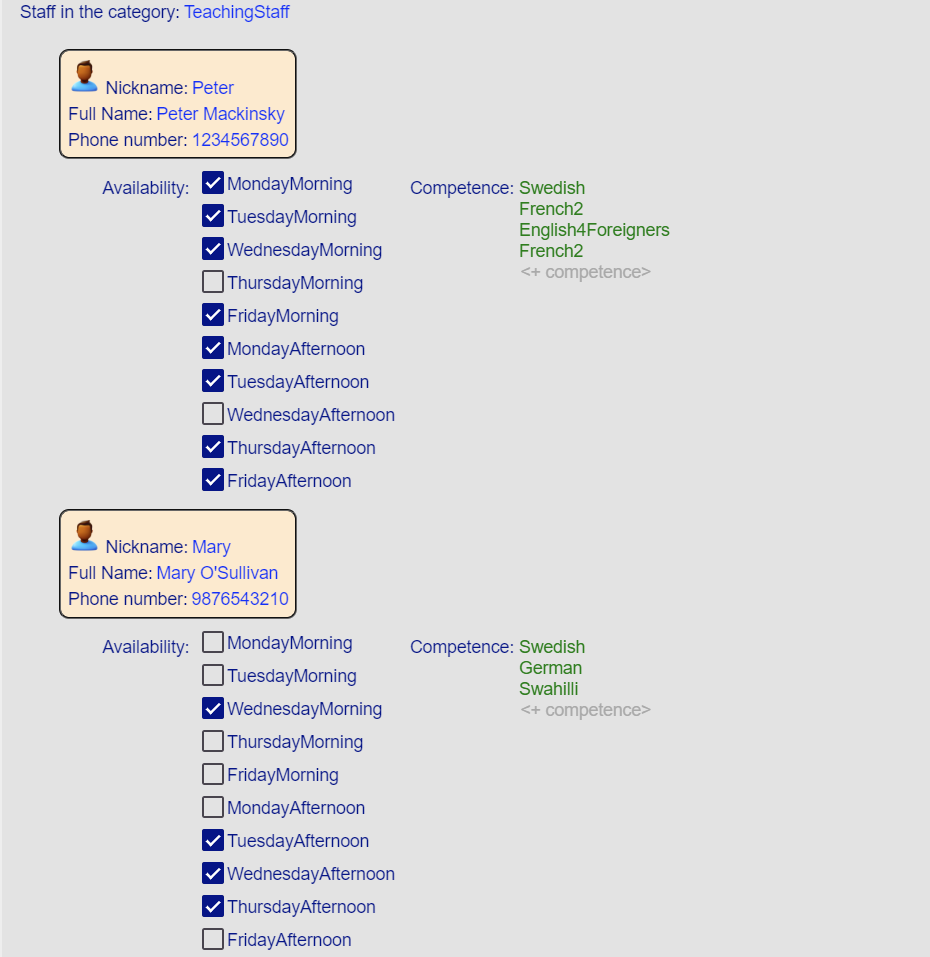
In this part of the example, you’ll learn how to enhance the look of the Staff model by adding an icon to each person.
We’ll create a custom Svelte component called PersonIcon.svelte and integrate it into the Freon editor.
Step 1: Create the Svelte Component
Start by creating a new Svelte component that represents the icon for each person.
Let’s name it PersonIcon.svelte.
Every external component in Freon must be associated with a box type, and in this case, our component will use the SimpleExternalBox.
The editor: FreEditor parameter is mandatory—Freon provides both props automatically at runtime.
// CourseSchedule/phase2/src/external/PersonIcon.svelte

<script lang="ts">
    import { SimpleExternalBox } from "@freon4dsl/core";
    import type { FreComponentProps } from "@freon4dsl/core-svelte";

    // Freon expects both props to be present, even if they are not used.
    // Props
    let { editor, box }: FreComponentProps<SimpleExternalBox> = $props();

</script>

<img src='./customImages/icons8-person-94.png' alt="Icon showing Person" height="30px"/>
Step 2: Add to the Global Section
Next, inform Freon about your new external component by modifying the global section of your editor configuration.
In main.edit, add the following:
// CourseSchedule/phase2/defs/main.edit#L3-L7

global {
    external {
        PersonIcon
    }
}
This tells Freon that a component named PersonIcon is available as an external component.
You can give it any name, but we’ll keep it simple and consistent.
Step 3: Include in the Projection
To use the new component, reference it in the editor’s projection for the Person concept.
Add [external=PersonIcon] in the fragment where you want it to appear.
To keep both the native and extended editors available, we’ll create a new projection set called externals.edit.
The icon will appear in the fragment that displays a person’s name and phone number.
Each fragment for the same concept must have a unique name, so we’ll name this one nameAndIcon.
// CourseSchedule/phase2/defs/externals.edit

editor externals

Person {[
    [fragment nameAndIcon]
        Availability: ${self.availability checkbox} Competence: ${self.competence}
]
fragment nameAndIcon [
[external=PersonIcon] Nickname: ${self.name}
Full Name: ${self.fullName}
Phone number: ${self.phone}
]
}
Step 4: Register in the Starter Code
Finally, register your external component so Freon can instantiate it.
Open externals.ts, import your component, and add it to the setCustomComponents call:
// CourseSchedule/phase2/src/external/externals.ts

import {setCustomComponents} from "@freon4dsl/core-svelte";
import PersonIcon from "./PersonIcon.svelte";

/**
 * Configure the external components used, so Freon can find them.
 */
export function configureExternals() {
    setCustomComponents([
        { component: PersonIcon, knownAs: "PersonIcon" },
    ]);
}
Final Result
After completing all steps, your editor will now display each person’s information along with the new icon.

✅ Conclusion
You’ve successfully added an icon component to the Staff model in the Freon editor!
By following these steps, you created a custom Svelte component, integrated it into the Freon editor, and made it available in your projections.
Next, you’ll learn how to access AST model data from within your external components.