On this page ...
A Wrapper with a Button
In this part of the example, we’ll create a custom wrapper component in Freon. The component wraps a native Freon property using the
Flowbite Svelte library. Our example combines a person’s **phone number** with a **button** that can trigger actions using that value. Here, clicking the button shows the phone number in a snackbar notification—but you could just as well send it to an external system to initiate a call or validate it against another database.Step 1: Create the Svelte Component
We’ll create PhoneButton.svelte, a wrapper for the phone number that provides a trigger button.
There are three key parts: Script, HTML, and CSS.
The Script Part
Declare the two mandatory props: editor and box.
The box is a NumberWrapperBox, which can wrap a number node
(see Wrapping Property Projections of Primitive type).
// CourseSchedule/phase3/src/external/PhoneButton.svelte#L8-L9

// Props
let { editor, box }: FreComponentProps<NumberWrapperBox> = $props();
Define functions to keep the component in sync when the AST or box model changes.
setFocus forwards focus to the wrapped box; refresh updates any model-driven view state.
// CourseSchedule/phase3/src/external/PhoneButton.svelte#L16-L21

async function setFocus(): Promise<void> {
    box.childBox.setFocus();
}
const refresh = (why?: string): void => {
    // do whatever needs to be done to refresh the elements that show information from the model
};
Register these with the box using reactive lifecycle hooks:
// CourseSchedule/phase3/src/external/PhoneButton.svelte#L22-L29

$effect(() => {
    box.setFocus = setFocus;
    box.refreshComponent = refresh;
});

const colorCls: string = 'text-light-base-50 dark:text-dark-base-900 ';
const buttonCls: string =
  'bg-light-base-600 					dark:bg-dark-base-200 ' +
The HTML Part
The HTML contains a wrapper <div> with the rendered phone number and an Flowbite button.
You cannot mount a box directly; instead, use Freon’s RenderComponent which renders any known box.
It requires both box and editor—the same props your component receives.
// CourseSchedule/phase3/src/external/PhoneButton.svelte#L33-L36

</script>

<div class="wrapper">
    Phone number: <RenderComponent box={box.childBox} editor={editor}/>
Add a toast/snackbar that appears when the button is clicked. The message includes the current phone value:
// CourseSchedule/phase3/src/external/PhoneButton.svelte#L38-L43

    <PhoneOutline class="{iconCls}" />
    </Button>
</div>

{#if showToast}
    <Toast color="green" onclick={() => showToast = false}>
The Style Part
Basic styling for the wrapper; Flowbite components themselves are themed via
Tailwind (already configured for the host app).// CourseSchedule/phase3/src/external/PhoneButton.svelte#L45-L52
{#snippet icon()}
<PhoneOutline class="{iconCls}" />
{/snippet}
</Toast>
{/if}
<style>
.wrapper {The Complete Component
// CourseSchedule/phase3/src/external/PhoneButton.svelte

<script lang="ts">
    import { Toast } from "flowbite-svelte";
    import { PhoneOutline } from 'flowbite-svelte-icons';
    import { type FreComponentProps, RenderComponent } from "@freon4dsl/core-svelte";
    import { NumberWrapperBox } from "@freon4dsl/core";
    import { Button } from 'flowbite-svelte';

    // Props
    let { editor, box }: FreComponentProps<NumberWrapperBox> = $props();

    let clicked: number = 0;
    let showToast: boolean = $state(false);

    // The following three functions need to be included for the editor to function properly.
    // Please, set the focus to the first editable/selectable element in this component.
    async function setFocus(): Promise<void> {
        box.childBox.setFocus();
    }
    const refresh = (why?: string): void => {
        // do whatever needs to be done to refresh the elements that show information from the model
    };
    $effect(() => {
        box.setFocus = setFocus;
        box.refreshComponent = refresh;
    });

    const colorCls: string = 'text-light-base-50 dark:text-dark-base-900 ';
    const buttonCls: string =
      'bg-light-base-600 					dark:bg-dark-base-200 ' +
      'hover:bg-light-base-900 		dark:hover:bg-dark-base-50 ' +
      'border-light-base-100 			dark:border-dark-base-800 ';
    const iconCls: string = 'ms-0 inline h-6 w-6';
</script>

<div class="wrapper">
    Phone number: <RenderComponent box={box.childBox} editor={editor}/>
    <Button tabindex={-1} id="about-button" class="{buttonCls} {colorCls} " name="ToastOpen" onclick={() => {clicked++; showToast = true}}>
    <PhoneOutline class="{iconCls}" />
    </Button>
</div>

{#if showToast}
    <Toast color="green" onclick={() => showToast = false}>
        This person has been called on number {box.getPropertyValue()}.
        {#snippet icon()}
            <PhoneOutline class="{iconCls}" />
        {/snippet}
    </Toast>
{/if}

<style>
    .wrapper {
        display:flex;
        flex-direction: row;
        justify-content: center;
        align-items: center;
    }
</style>
Step 2: Add to the Global Section
Register the component in the editor’s global section:
// CourseSchedule/phase3/defs/main.edit#L3-L8

global {
    external {
        PersonIcon,
        PhoneButton
    }
}
Step 3: Include in the Projection
Use the wrapper in the Person projection by adding wrap=PhoneButton to the phone property.
We’ll keep this in the externals.edit projection set we introduced earlier:
// CourseSchedule/phase3/defs/externals.edit

editor externals

Person {[
    [fragment nameAndIcon]
        Availability: ${self.availability checkbox} Competence: ${self.competence}
]
fragment nameAndIcon [
[external=PersonIcon] Nickname: ${self.name}
Full Name: ${self.fullName}
${self.phone wrap=PhoneButton}
]
}
Step 4: Register in the Starter Code
Tell Freon how to instantiate the component:
// CourseSchedule/phase3/src/external/externals.ts

import {setCustomComponents} from "@freon4dsl/core-svelte";
import PersonIcon from "./PersonIcon.svelte";
import PhoneButton from "./PhoneButton.svelte";

/**
 * Configure the external components used, so Freon can find them.
 */
export function configureExternals() {
    setCustomComponents([
        { component: PersonIcon, knownAs: "PersonIcon" },
        { component: PhoneButton, knownAs: "PhoneButton" },
    ]);
}
Final Result
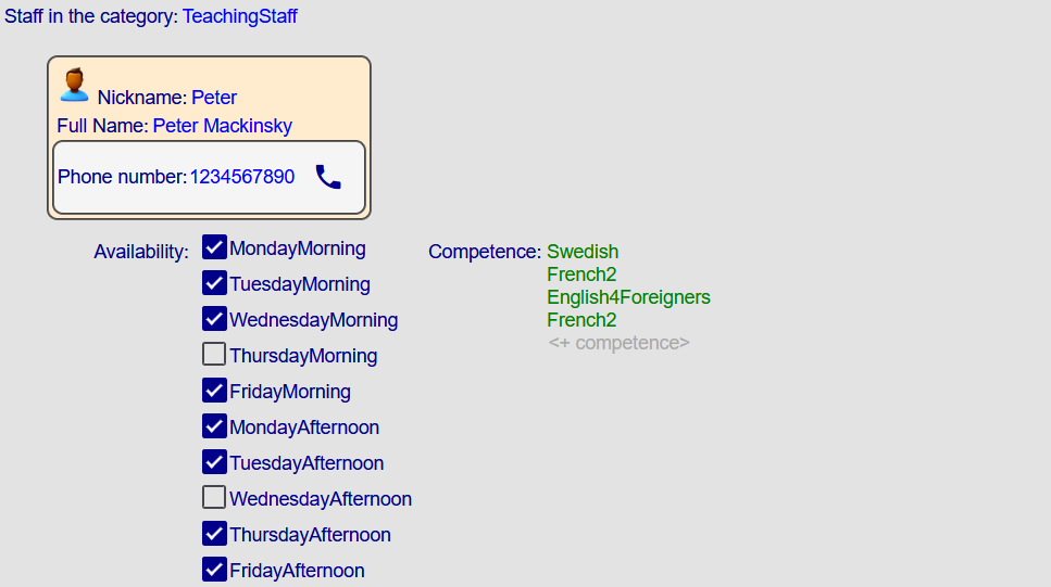
Your editor now shows a phone button next to each number. Clicking it opens a snackbar with the number:

Conclusion
You’ve added a custom wrapper component to the Freon editor.
It wraps a phone number and includes a button that triggers a snackbar.
From here, you can build richer integrations—dialers, validations, or external lookups—fully integrated with your Freon projections.
Next, you’ll learn how to replace the component that renders a list.